Constellation
2025
As part of a collaboration with Microsoft, I was brought on to lead the design for the second phase of a Constellation's new digital platform. This application would serve as the central way customers and business partners would transact and interact with the company.
Role
Lead UX Designer
Employer
Ascendion x Microsoft
Timeline
Q4 2024 - Q1 2026


Images and screenshots have replaced any specific language referring to Constellation's business partners and practices.
Overview
Constellation is the leading supplier of carbon-free energy in the U.S., with its headquarters in Baltimore, MD. The company serves customers at every level—from small businesses and residential households to multibillion-dollar corporations.
With the project still ongoing, the second phase of Constellation’s new digital platform is expected to serve millions of customers and support the company’s long-term growth. I was brought on through a contract with Microsoft to help bring this next stage of the initiative to life.
The first phase focused on consolidating and unifying Constellation’s existing online resources while establishing a foundational design system. The second phase builds on that foundation, with an emphasis on growth—introducing new features and capabilities shaped by customer research and aligned with business priorities.
Working in collaboration with IDEO Boston and Microsoft, this engagement has been one of the largest of my career. I have played a central role in guiding stakeholders and business leaders at this Fortune 200 company through critical design decisions, ensuring alignment across teams and establishing a vision for the platform’s continued evolution.

Challenges
To really understand this project, I think it's important to highlight the challenges—not just as individual obstacles but as they relate to each other and actually compound one another. This interconnected complexity is what made this project unique when finding design solutions.
Inherited Design System
The existing components couldn't support 15+ new features without expansion—requiring me to balance consistency with innovation.
Diverse User Spectrum
Designing for homeowners, small businesses, corporate energy managers, and internal employees—each requiring different levels of data, control, and sophistication.
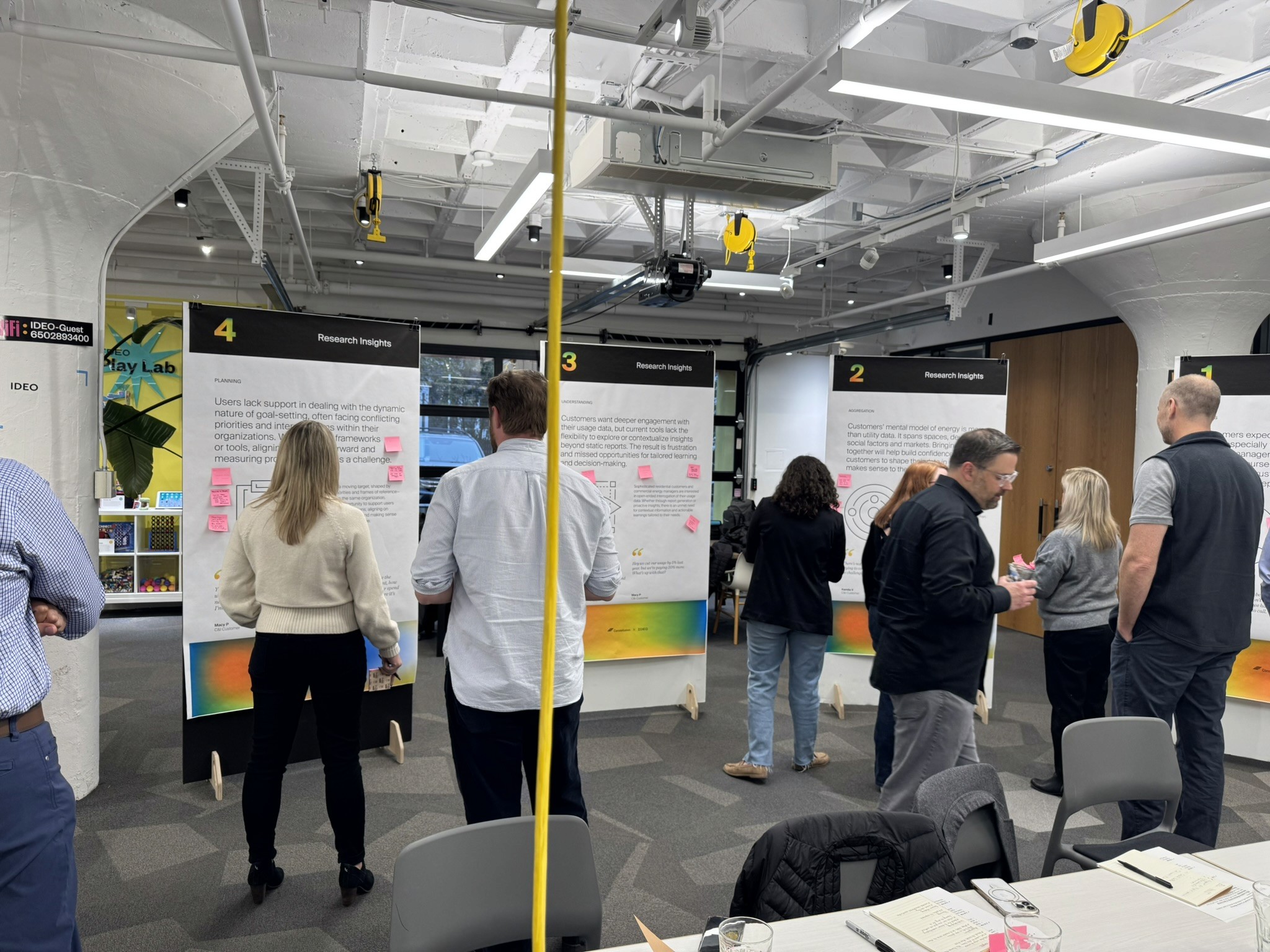


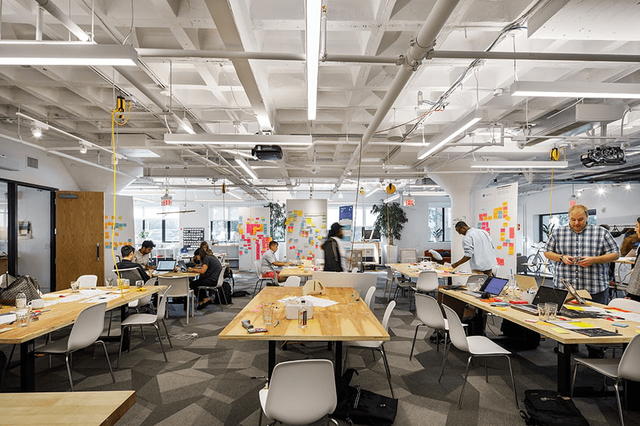
IDEO Boston
Research & Discovery
Research shaped every phase of this project, from initial strategic alignment to ongoing validation of design decisions. The process combined stakeholder workshops, user insights, and competitive analysis to ensure solutions were grounded in real needs.
In developing the report generation screens, together with past recordings, I drafted several versions to present to Geotherm. We carried the prototype through some testing to decide which layout would work best.
Aligning leadership on user-centered strategy
I participated in a two-day onsite workshop facilitated by IDEO, designed to shift leadership perspective from internal assumptions to user-centered thinking. The workshop helped stakeholders identify new business opportunities and feature priorities grounded in customer needs rather than legacy processes.
Key outcomes:
Aligned cross-functional leaders on user needs across segments
Identified priority features for Phase 2
Established shared language for discussing customer value
Competitive analysis: Learning from industry patterns
Many features proposed by stakeholders were positioned as "wholly unique" to Constellation. Through ongoing competitive analysis, I identified established patterns and proven UI components that directly paralleled our needs—allowing us to leverage industry best practices rather than reinvent solutions.
1. Energy sector platforms
How competitors handle complex account management and billing
Multi-segment B2C/B2B products
Patterns for serving diverse user types within one platform
Enterprise dashboards
Tried-and-true components for data visualization and account controls
Design System & Process
Advocate for the process
One of the many challenges mentioned above was a high turnover rate of leadership for the project. Combining this with competing stakeholder priorities and it's easy to see how a project to can go off track. I mitigated this by showing a consistent design process. I advocated for a deliberate collaboration structure that started small and scaled intentionally:
Small group collaboration first
Work with subject matter experts and key stakeholders per feature
Build alignment on core requirements and constraints
Iterate quickly without the noise of a large group
Then scale to broader stakeholder review
Present refined concepts to leadership with clear rationale
Ground decisions in research and user needs
Use the collaborative foundation to defend against scope creep
This approach gave stakeholders confidence in the process, making it easier to navigate competing requests without compromising the user experience.
A repeatable design methodology
1. Research & pattern analysis
Identify proven patterns and validate against user needs. Present findings to subject matter experts to establish design direction.
2. Lo-fi iteration with options
Explore 2-3 approaches to solve the same problem. Document trade-offs clearly—UX decisions rarely have a single "right" answer, so showing options with pros/cons helped stakeholders understand the rationale behind the recommended direction.
Why multiple options matter:
Demonstrates thorough thinking
Educates stakeholders on design trade-offs
Creates buy-in through collaborative decision-making
3. Hi-fi design & developer collaboration
Work closely with engineering and QA to identify gaps in understanding before handoff. Regular check-ins ensured technical constraints were addressed early and edge cases were designed, not improvised during development.
Scaling the design system
As new features introduced requirements beyond the Phase 1 foundation, I systematically evolved the design system:
Documented new components and patterns
Established governance for when to create vs. adapt existing elements
Created clear handoff artifacts that developers could reference independently
The outcome: A design system that could scale across business units while maintaining coherence—critical for a platform serving millions of users across diverse segments.

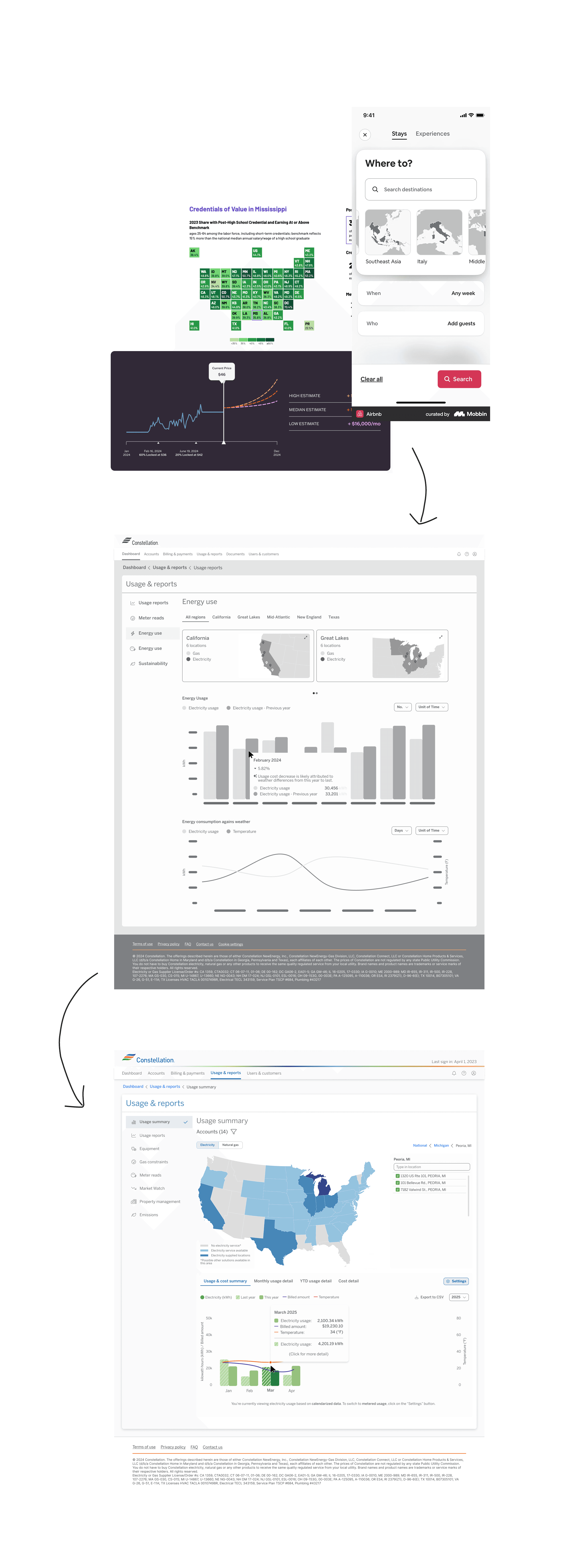
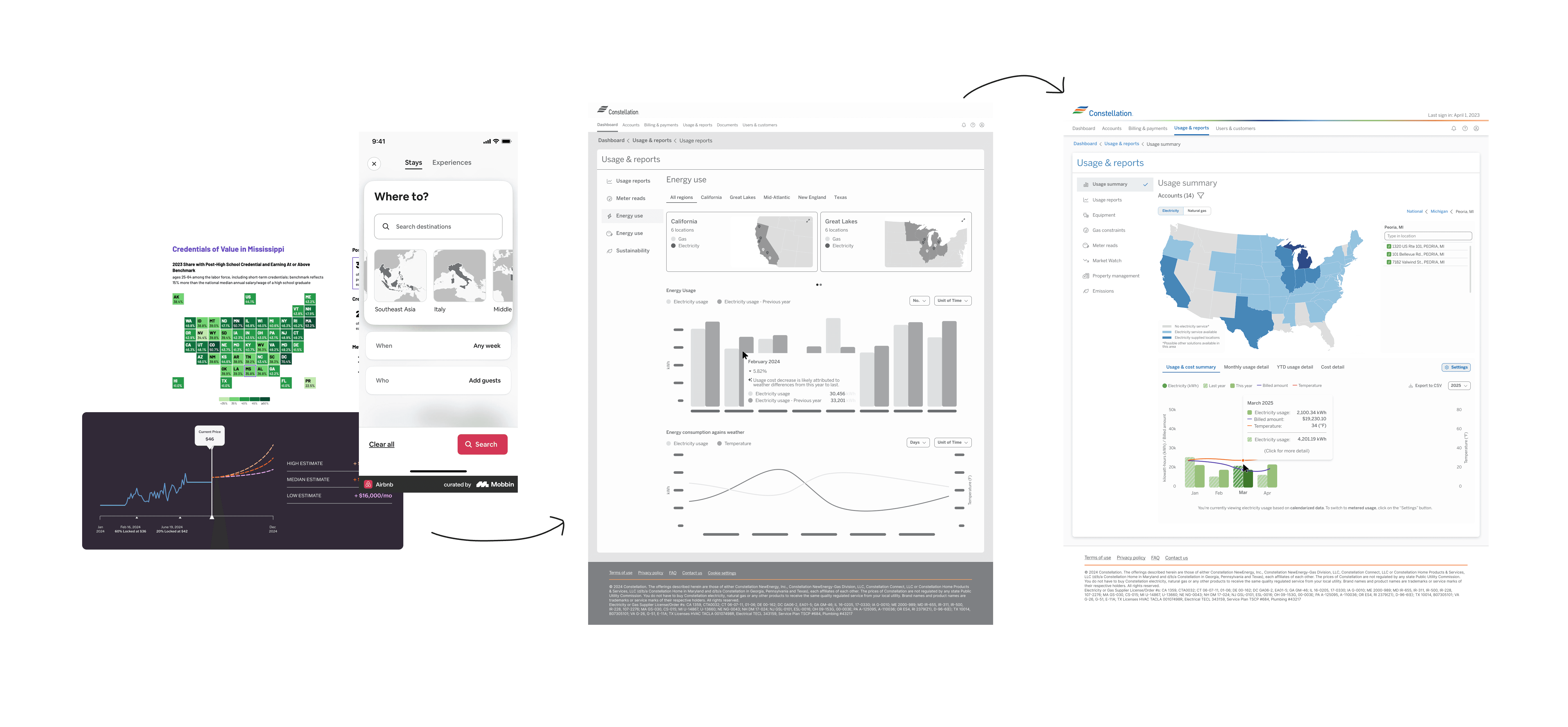
Map and data visualization
Feature Showcase
1 of 3
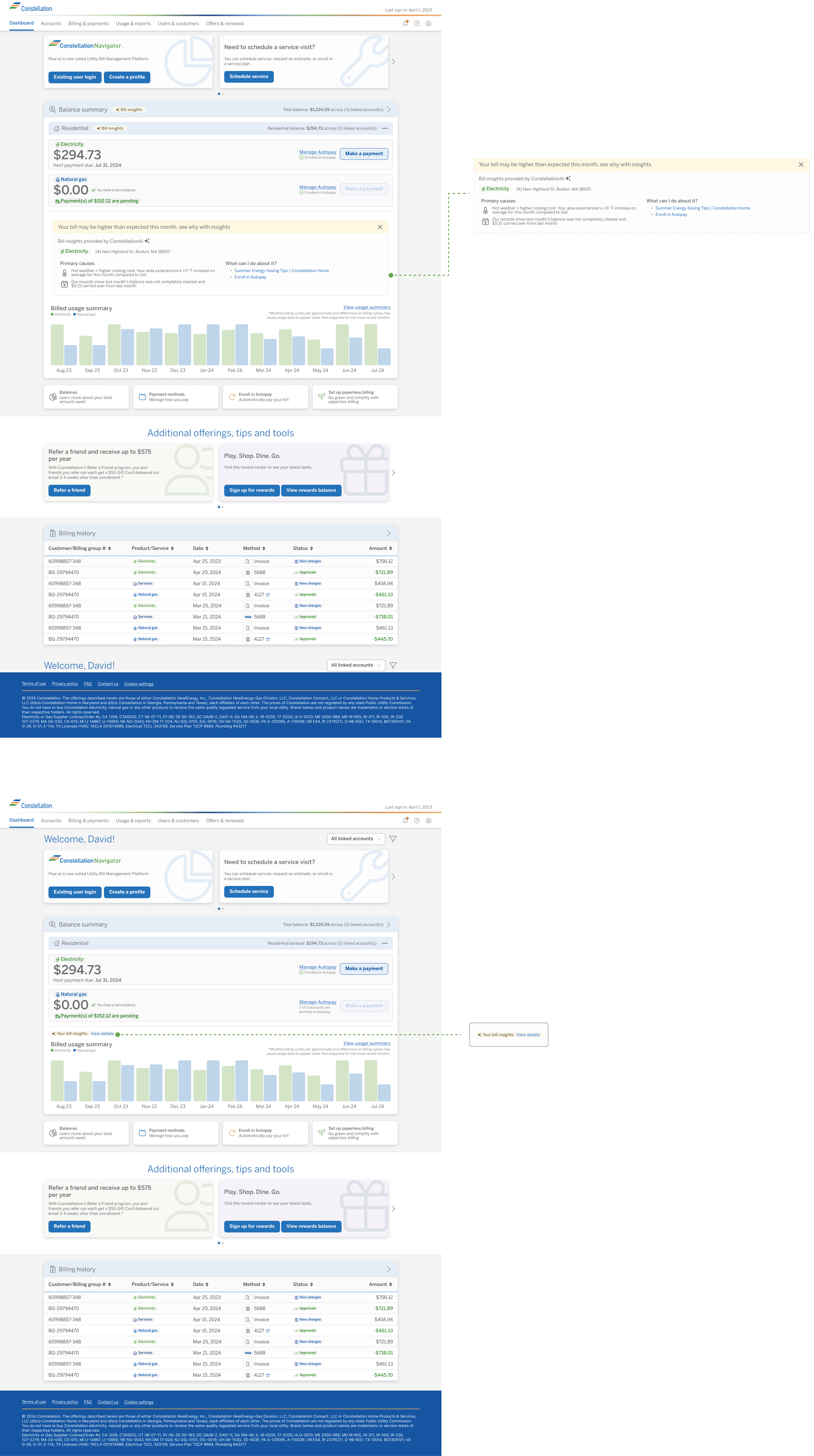
Autopay
The challenge: Hidden functionality in plain sight
Autopay began as a straightforward UI addition—add a toggle to the existing payment methods table and create a confirmation dialog. Simple enough. But during self-testing, I uncovered a critical accessibility issue that would have buried the feature from most users.
Discovering the problem
The original design placed the autopay toggle as the last column in an already-wide payment methods table. On desktop, this meant horizontal scrolling was required to access the toggle—but there was no visual indicator that additional columns existed.
Testing the assumption: I conducted informal usability tests with friends and family, giving them one task: find where to turn autopay on or off.
2 out of 3
2 out of 3 participants could not find the toggle at all.
> 1 min
The one participant who did find it took over a minute to find it.
Zero
None of the participants knew to scroll horizontally.

The feature was functionally invisible.
Advocating for users over convenience
Rather than simply adding to the existing table structure, I pushed for a redesign that prioritized autopay and payment method management—the two actions users would actually need.
The solution:
Moved autopay controls to a prominent, immediately visible position
Removed unnecessary table columns that added cognitive load without value
Restructured the payment methods interface to surface primary actions first
Pushback & resolution: Stakeholders initially resisted changing the existing table structure, viewing it as scope creep. I presented the usability test results and reframed it as a foundational accessibility fix—not a feature expansion. The data made the case.
Impact
Improved discoverability: Autopay enrollment became immediately accessible without hunting
Reduced support burden: Clearer UI meant fewer users needing help finding the feature
Better accessibility: Eliminated reliance on horizontal scrolling for core functionality
Key takeaway: Even "simple" features deserve scrutiny. Self-testing and advocating for users—even when it means challenging existing patterns—prevents launches that technically work but fail in practice.
2 of 3
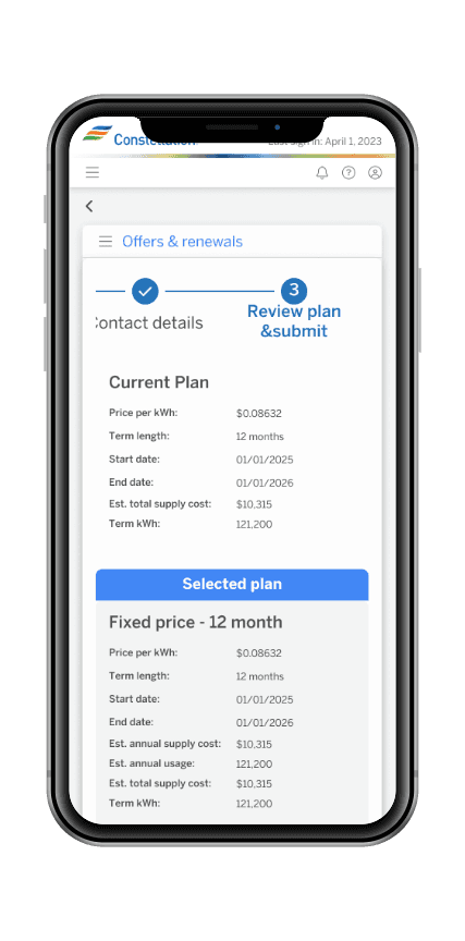
Energy Renewal
The opportunity: Bringing renewals online
Energy contract renewals had always required contacting an account manager by phone or email—a slow, opaque process. Moving renewals online would give customers self-service access to same-day energy pricing, allowing them to monitor fluctuations and lock in rates on their own terms.
The challenge: designing a renewal flow as complex as filing taxes or purchasing insurance, across multiple business segments with different requirements.
Commercial renewals: Learning from constraints
The problem: Commercial customers often manage multiple accounts, each requiring separate renewal decisions. Stakeholders pushed for an accordion-based layout, inspired by a different application they'd seen. The result: UI congestion that slowed page performance and buried critical information under collapsed sections.
What went wrong:
All renewals crammed into a single page with accordion components
Page load degraded with multiple accounts
Users couldn't easily compare options or track their progress
Pattern borrowed from a different context didn't translate
The constraint: Early in the project, I lacked the authority to push back effectively. Leadership prioritized speed over iteration, and the design shipped with known issues.

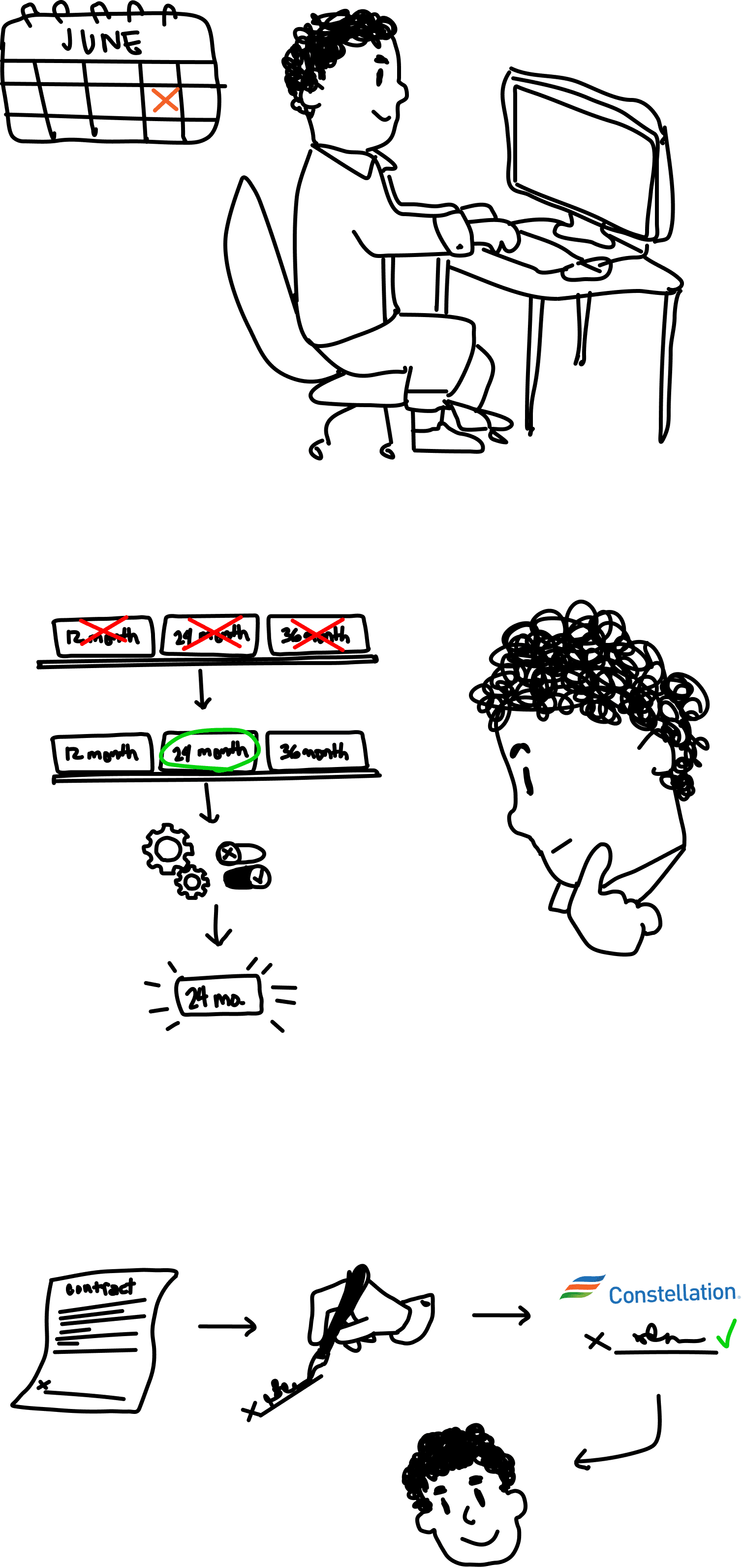


Small Business renewals: Applying the lessons
By the time Small Business renewals entered the roadmap, I had established ownership of the UX design process through consistent delivery on other features. This gave me the credibility to advocate for a different approach.
The redesign:
Replaced accordion with step-by-step pagination: Broke the renewal process into focused stages, reducing cognitive load and improving performance
Surfaced critical information progressively: Each step presented only what users needed at that moment—pricing, terms, disclaimers—without overwhelming them
Set clear expectations: Called out when processes would move outside the platform (e.g., DocuSign for contract signing) and when pricing holds would expire
The complexity: This wasn't just about UI simplification. I worked closely with business analysts, legal, QA, and developers to:
Sequence disclaimers and legal requirements appropriately
Display real-time pricing with clear expiration timelines
Guide users through a multi-stage commitment process similar to insurance purchasing or tax filing

Original design for commercial renewal has a ridiculous horizontal scroll. Not to mention the accordion design has the potential to make the user lose their place.

Redesign for business renewal greatly reduced horizontal scroll and segments flow into dedicated pages for a more focused workflow.

Created some variations to utilize the space more meaningfully, ultimately were scrapped for development timeline.
Collaboration across teams
The Small Business renewal flow required tight coordination:
Business analysts: Defined state-specific requirements and pricing logic
Legal: Ensured compliance with disclosure timing and contract language
QA: Validated edge cases like expired pricing and incomplete sessions
Developers: Handled technical constraints around pricing APIs and session management
I facilitated alignment by creating detailed flows that documented every decision point, edge case, and handoff to external systems.
Impact
Small Business renewals:
Streamlined process reduced user confusion and improved completion rates
Step-by-step approach eliminated performance issues from accordion design
Clear expectation-setting reduced support inquiries about external steps
Lessons applied forward: The Small Business renewal design became the template for future complex transactional flows, establishing patterns the team could reuse across the platform.
Validation: The Small Business renewal flow was received so well by the business that at the close of the project, the team reallocated remaining story points to bring Commercial renewals in line with the same design standard—an acknowledgment that the original approach hadn't served users or the business as well as it could have.
Key takeaway: Complex workflows require more than borrowed patterns—they need context-specific solutions. Commercial renewals taught me what didn't work; Small Business renewals gave me the opportunity to apply those lessons with the authority to execute properly.
3 of 3
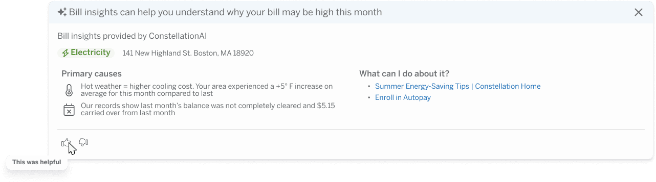
AI High Bill Explanation
The opportunity: From reactive to contextual
High bill inquiries are one of the most common reasons customers contact support. The straightforward solution—triggered flags and canned responses—already existed as a viable path. AI elevated it into something more meaningful: personalized, contextual explanations that combine rate changes, weather patterns, usage history, and contract-specific terms to tell each customer their story.
The goal was clear: reduce call volume, surface actionable solutions, and create opportunities to connect customers with relevant products or services—all without replacing the need for human support entirely.
Framing AI for business leaders
By this phase, the team structure had shifted—new project managers, a refined process, and a deliberate push to integrate AI across the final feature set. The decision to build the feature had already been made before I came on, as was the case with most features on this project.
My role was to ensure the business understood what AI could and couldn't do—and why that distinction mattered for the UI. In presentations to leadership I consistently stressed:
Without AI: Flags trigger pre-written explanations. Generic, one-size-fits-all.
With AI: Explanations are generated specific to the user—combining rate changes, weather data, usage history, and contract terms into a complete, readable picture.
The design implication: If the content is dynamic and personalized, the UI has to be built to support that—not constrain it with rigid, templated layouts.
This framing directly shaped design decisions throughout the feature.


Research foundation
The initial concept workshopped by the team had several significant issues. I identified and resolved each:
Nested accordions The original concept placed the AI module inside an accordion nested within another accordion—requiring users to mentally map multiple layers to access the explanation. I argued against this pattern as a known UX failure point and pushed for a solution that surfaced the content more directly.
A dismissible, returnable module Rather than a static placement, I designed the module to be dismissible—replaced by a chip or pill that users could tap to reopen if needed. This respected users who didn't need the explanation while keeping it accessible for those who did. This was my solution entirely.
Rethinking the feedback mechanism Standard AI feedback patterns—thumbs up/thumbs down—didn't fit here. This wasn't a conversational AI interface. I replaced it with a simple "Was this helpful?" dropdown with a select few response options, giving the business meaningful qualitative data without forcing an interaction pattern that didn't match the context.
Visibility without repetition Stakeholders wanted a chip repeated throughout the billing section to signal AI insights were available. The problem: the AI module lived at the grandchild level of the accordion. Surfacing a generic callout at the top level implied AI insights existed for every parent section—which wasn't true.
My compromise:
At the grandparent level: "Residential insight available"—specific enough to set accurate expectations
At the relevant section: "Insight available"—direct and contextual
I would have preferred no callout at all. The dashboard was already information-dense. But this was a workable middle ground that avoided misleading users while satisfying the visibility requirement.
Anticipated impact
Anticipated 70%+ reduction in high bill support calls
The feature launched at the close of my contract, so measured results weren't available during my engagement. Based on existing call log data however, high bill inquiries represented a significant portion of inbound support volume. A well-executed self-service explanation—personalized and contextual—was projected to handle an anticipated 70% or more of those inquiries without human intervention.
The remaining calls would still require human support—and the feature was never positioned as a replacement for that. The goal was to resolve the cases that didn't need it.
Key takeaway: AI only adds value when the design accounts for what makes it different from a rule-based system. Generic placement and templated UI undermine the personalization that makes AI worth building in the first place. Every decision here—from dismissibility to feedback mechanisms to visibility callouts—was in service of that principle.

Impact & Reflections
With the project recently concluded, measurable outcomes are still emerging. But the impact of this engagement is visible in other ways—a scalable platform ready to serve millions of users, a design system mature enough to support continued growth, and three complex transactional features that didn't exist before.
Throughout the engagement, my approach to stakeholder collaboration and design leadership was consistently recognized by both Microsoft and Constellation leadership—a reflection of the trust built through process, advocacy, and delivery.
A few things I'd carry into every project going forward:
Process is your most valuable deliverable On a project this size, with shifting leadership and competing priorities, the design process itself became the stabilizing force. Establishing structure early—and advocating for it consistently—kept the work moving forward when everything else was in flux.
Small rooms make better decisions Starting with subject matter experts before scaling to broader stakeholder reviews consistently produced stronger outcomes. Large groups without context slow momentum. Earned alignment is more durable than consensus by committee.
Research is your best defense Proven patterns and data gave every design recommendation a foundation that was hard to argue with. It moved conversations from opinion to evidence—especially critical when navigating high-ranking stakeholders with strong preferences.
AI is only as good as the design around it The most technically capable feature can be undermined by poor placement, unclear expectations, or borrowed UI patterns that don't fit the context.