Geotherm
2023
I was brought on to help design the later stages of a a robust web application. This application was built to handle the business operations of Geotherm from top to bottom and was still missing some key features when I started.
Role
UX Designer
Employer
Ascendion

Images and screenshots have blurred out logos, specific company information, anything that alludes to Geotherm's proprietary business model
Overview
Geotherm has a highly technical business process. As an overhead view, they measure the "thermal resistivity" of soil. The implications for measuring this accurately and consistently for any project involving infrastructure can be a difference of millions of dollars saved.
Geotherm wanted a way to consolidate a lot of their process onto one app: client submissions, lab tests, inventory, report writing, client communication, invoicing, and everything in between.

Challenge
The project had been going on for months before I joined. There was a sizeable amount of cleanup needed and key screens missing. I came on to lead the design as the current senior UX designer at the time transitioned out of the project.
I spent the first few days catching up on video recordings, emails, and notes made on the project with Geotherm prior. The largest challenge of this project was absorbing the technical and dense science and process in such a short amount of time. I achieved this by breaking it up.
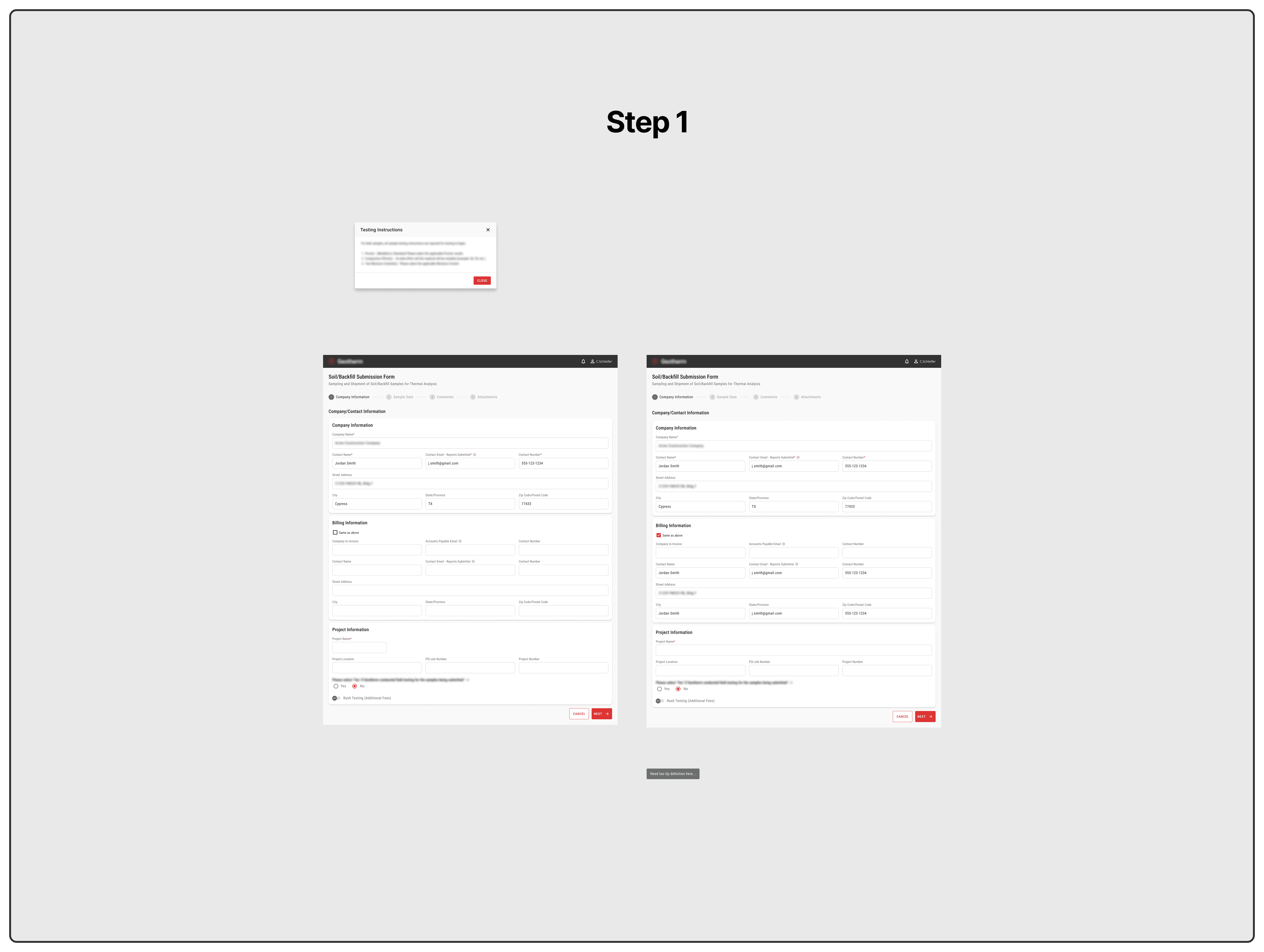
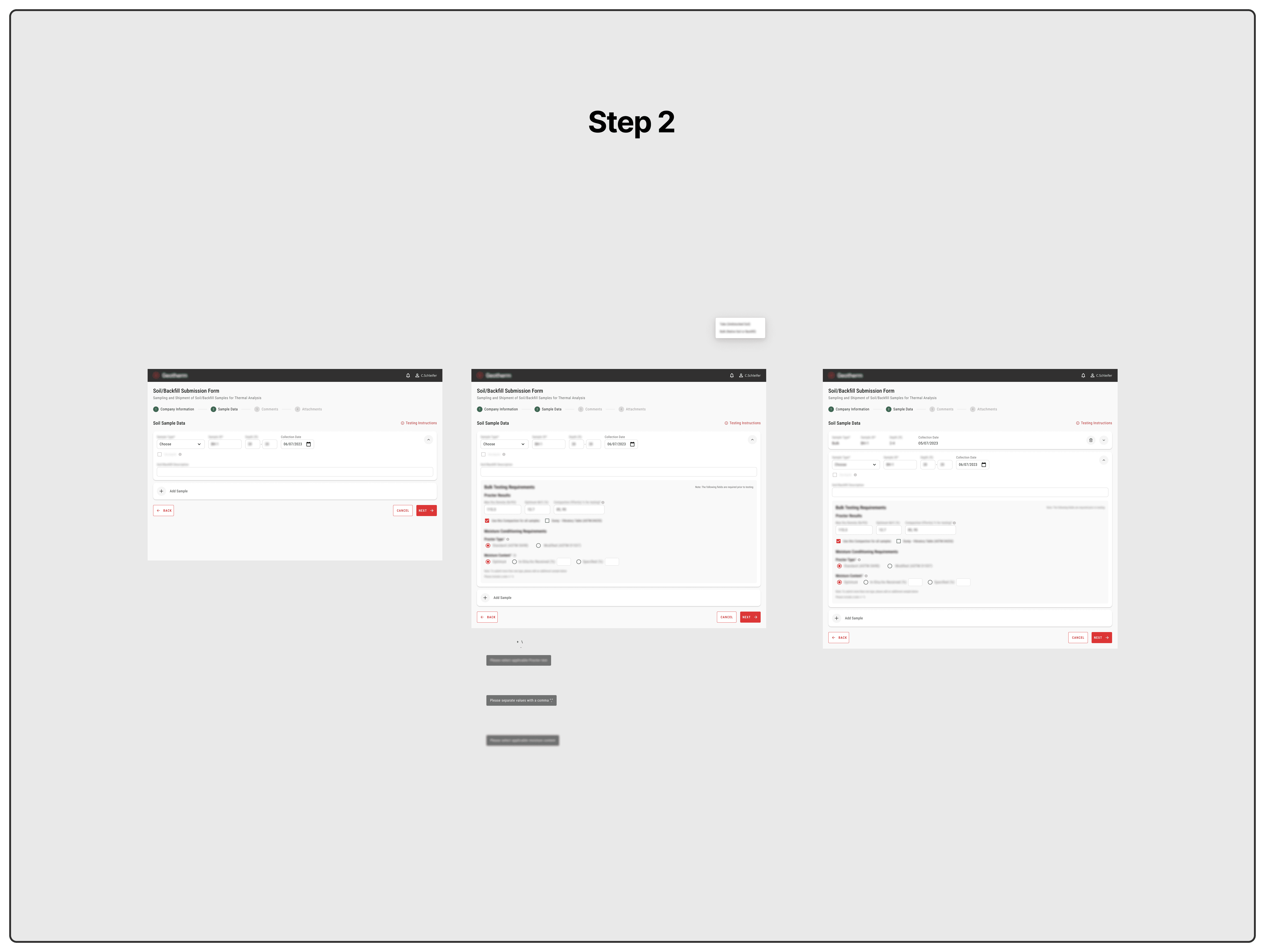
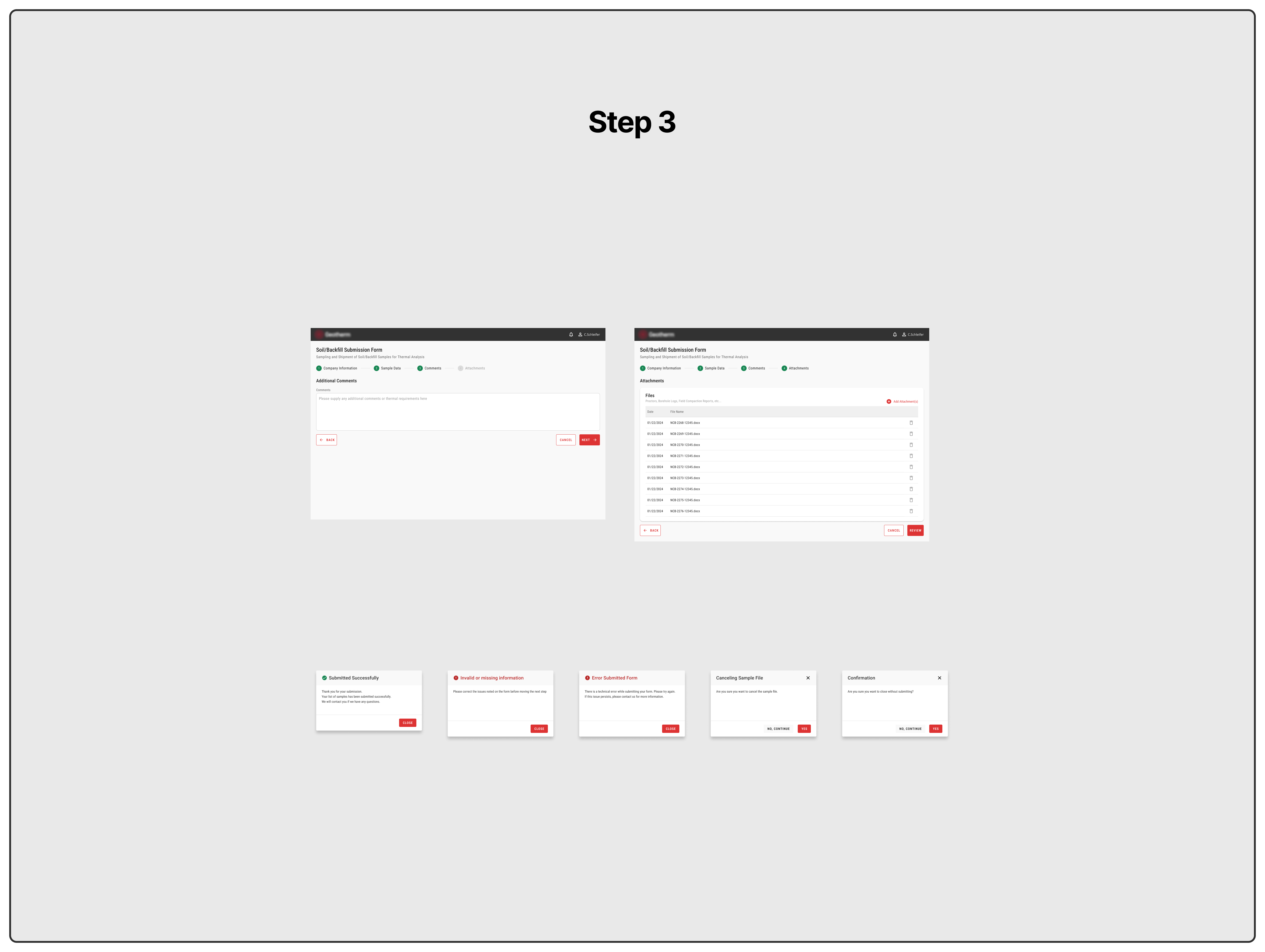
There were three major pieces: client submission and correspondence, testing and worksheets, report generation and invoicing.
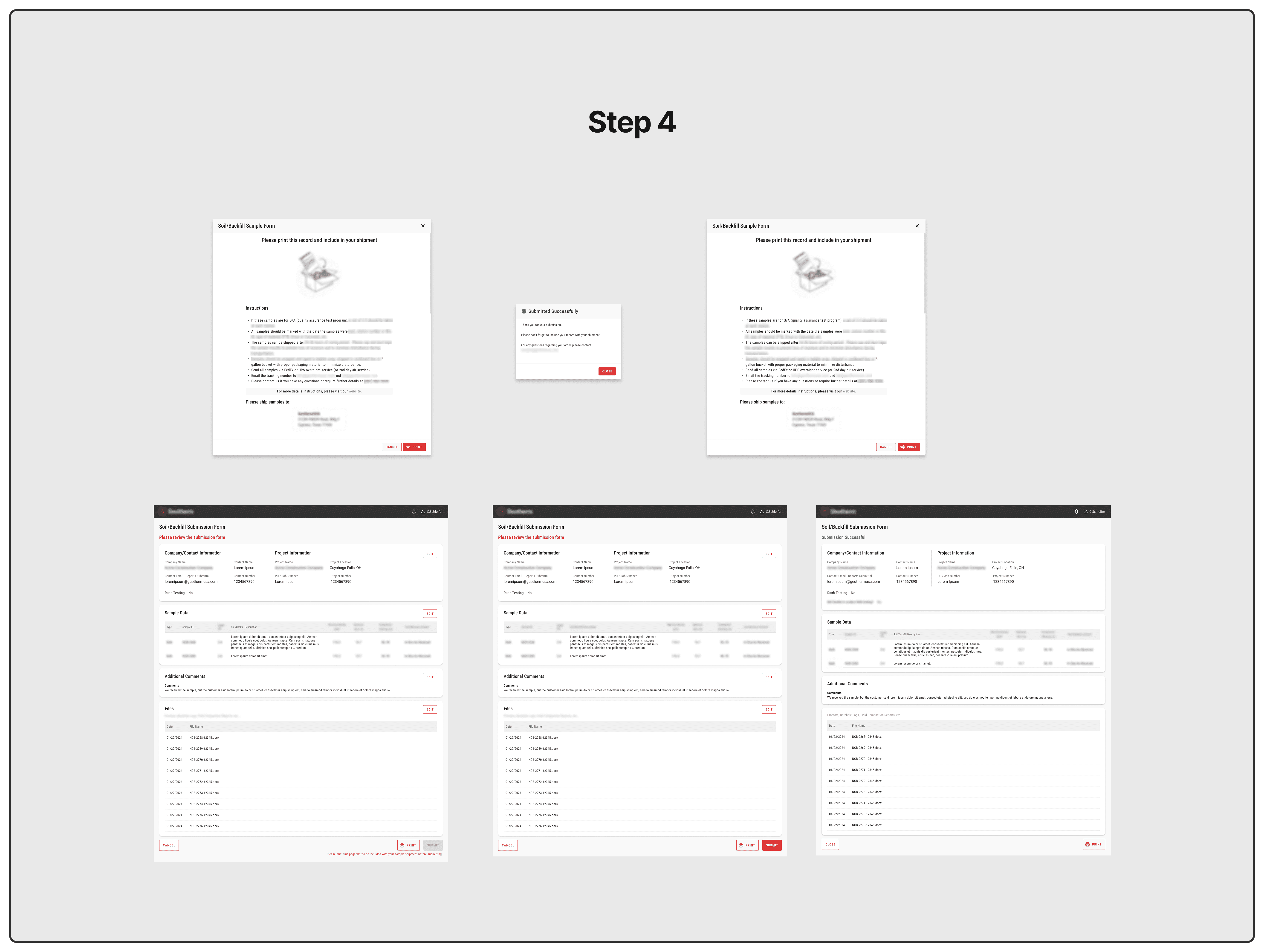
Most of my work was done on the first piece and most importantly, the last piece. The last piece hadn't been built yet and in the end, that is what they are providing to the customer.

Process
One of the benefits of working with Geotherm is the active involvement of stakeholders at every stage of the process. This application was built to be used exclusively in-house and so their feedback was invaluable. This relationship with the stakeholders allowed for an ideal design process, allowing me to rapidly iterate and test ideas.
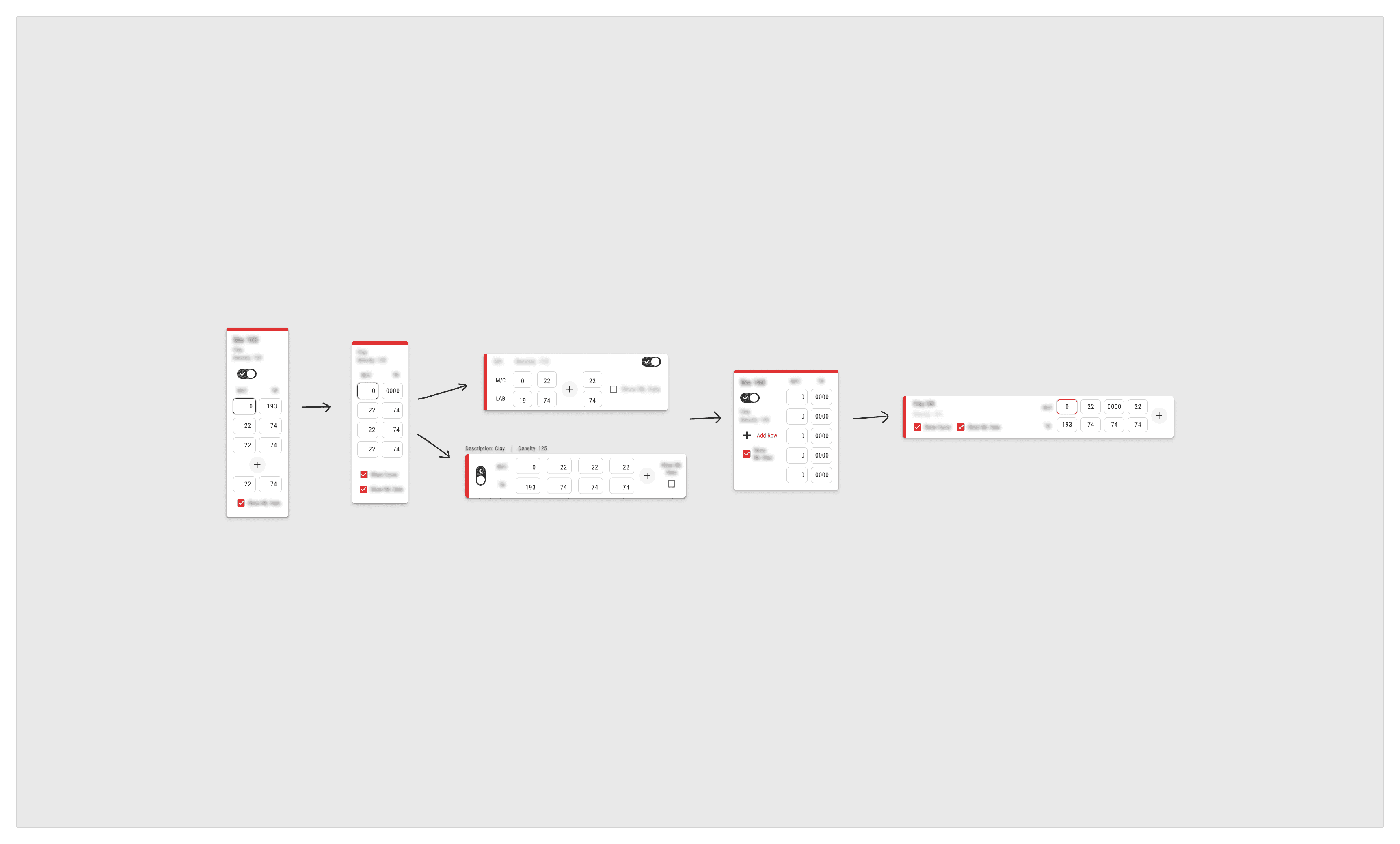
In developing the report generation screens, together with past recordings, I drafted several versions to present to Geotherm. We carried the prototype through some testing to decide which layout would work best.
The key was to modernize their current process without deviating too far from the initial intent and function.
Back to the beginning
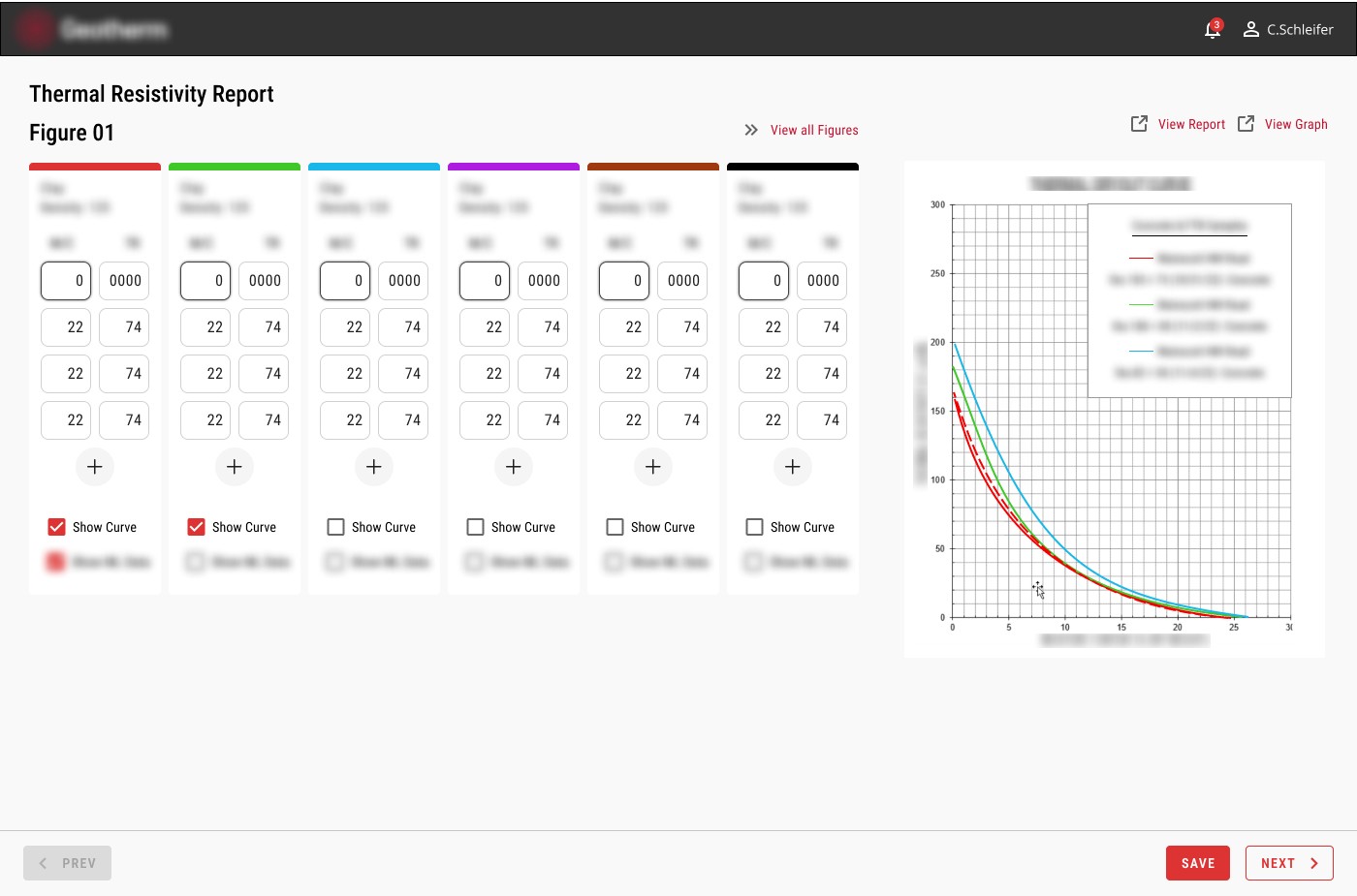
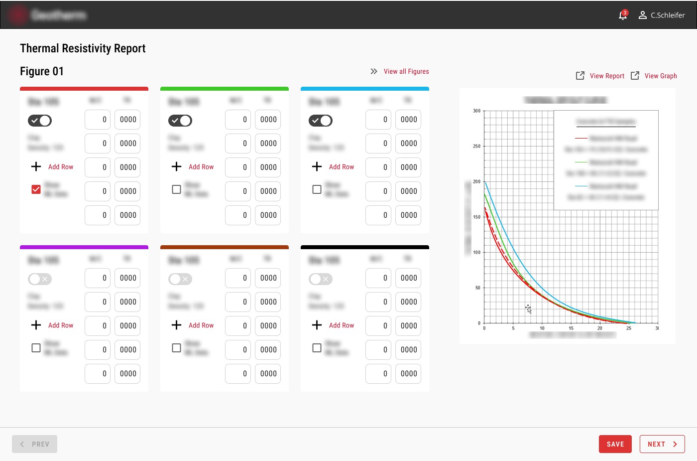
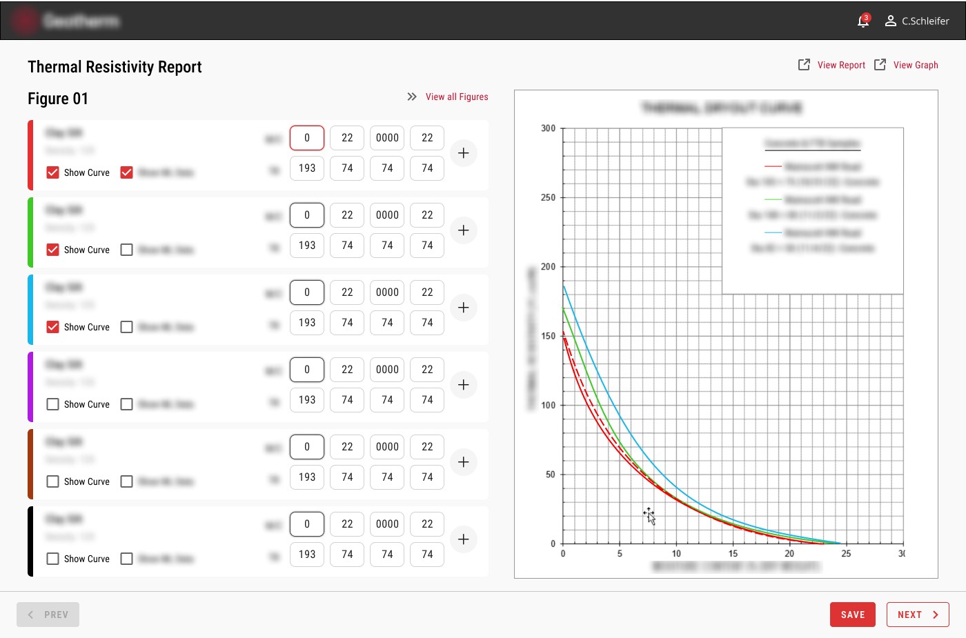
The report is what Geotherm provides to the customer at the end of this entire process. Of course, every stage of this application is important, but these screens were the final result and essentially the core of their business.
Generating and verifying the figures from their testing was only half of the reporting process. We also needed to consider common user scenarios and how the system would handle specific edge cases. With one component of this larger process nailed down, I began to rapidly prototype how it would fit into the grander scheme of this segmented process.
Because the reporting stage is so important and the final deliverable they provide to the customer, we needed to build a way for their employees and report writers to review and edit the report for any errors all while maintaining a seamless workflow. Geotherm's business model has to be highly accurate and sequential because of the scientific nature of their work. I had to make sure that collaboration did not sacrifice or interrupt accuracy.
And on top of it all, generating the actual report relies heavily on the backend architecture. Together with the development team we framed the design to account for what was possible and any functionality requests that might break the system logic.
Fitting the missing pieces reveals a larger puzzle
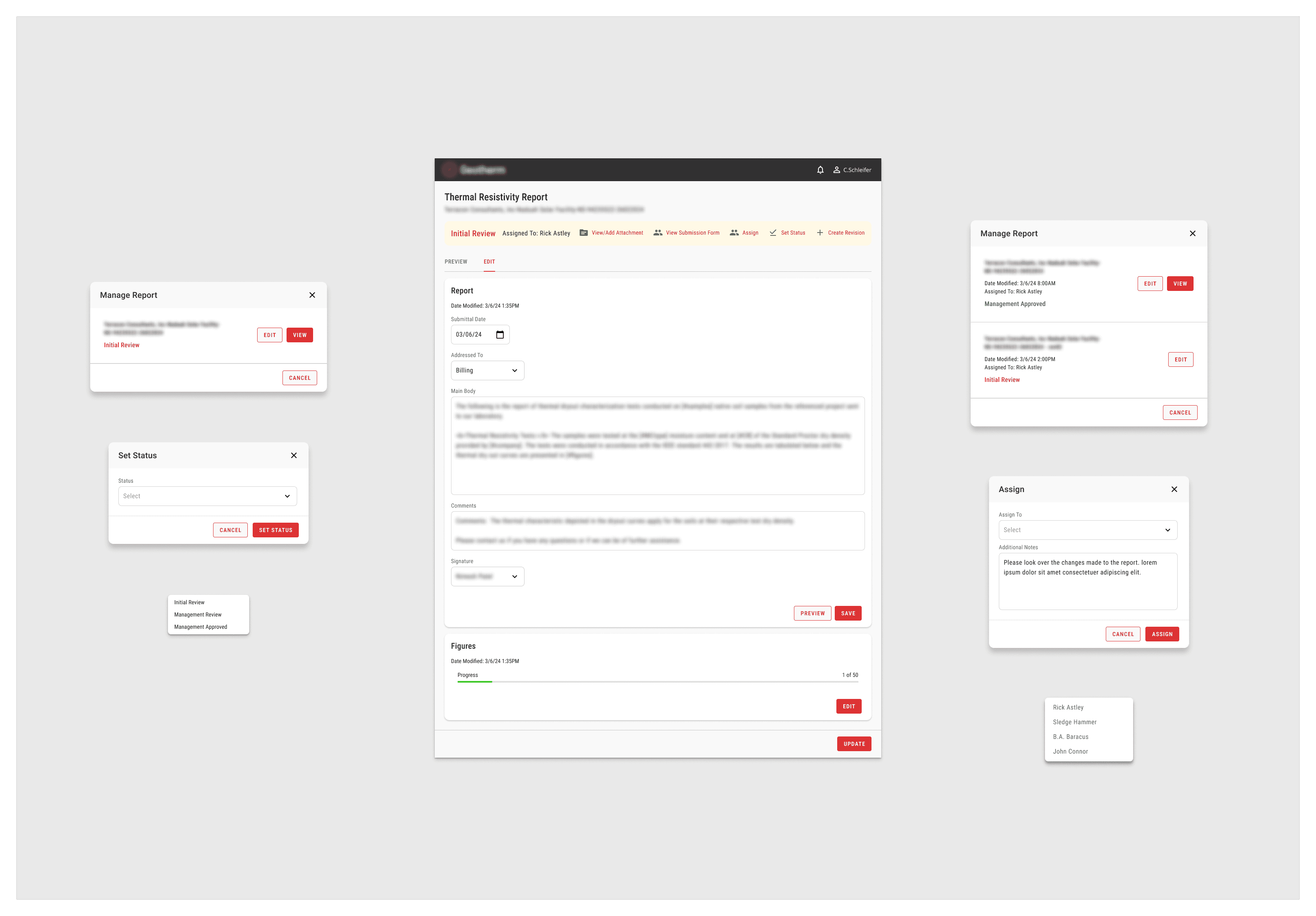
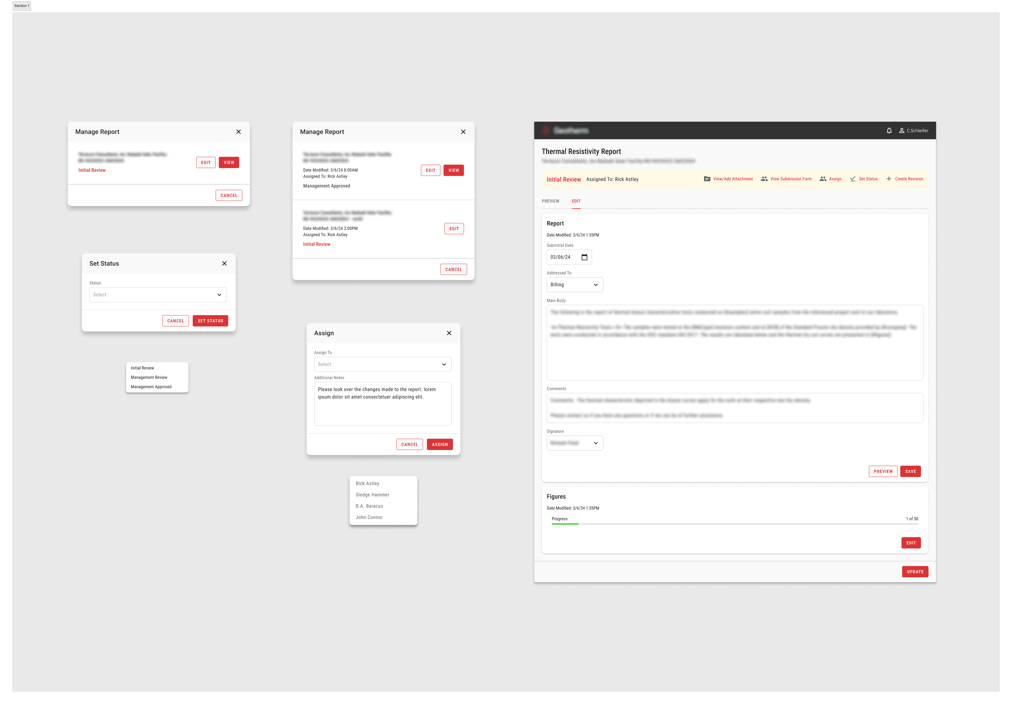
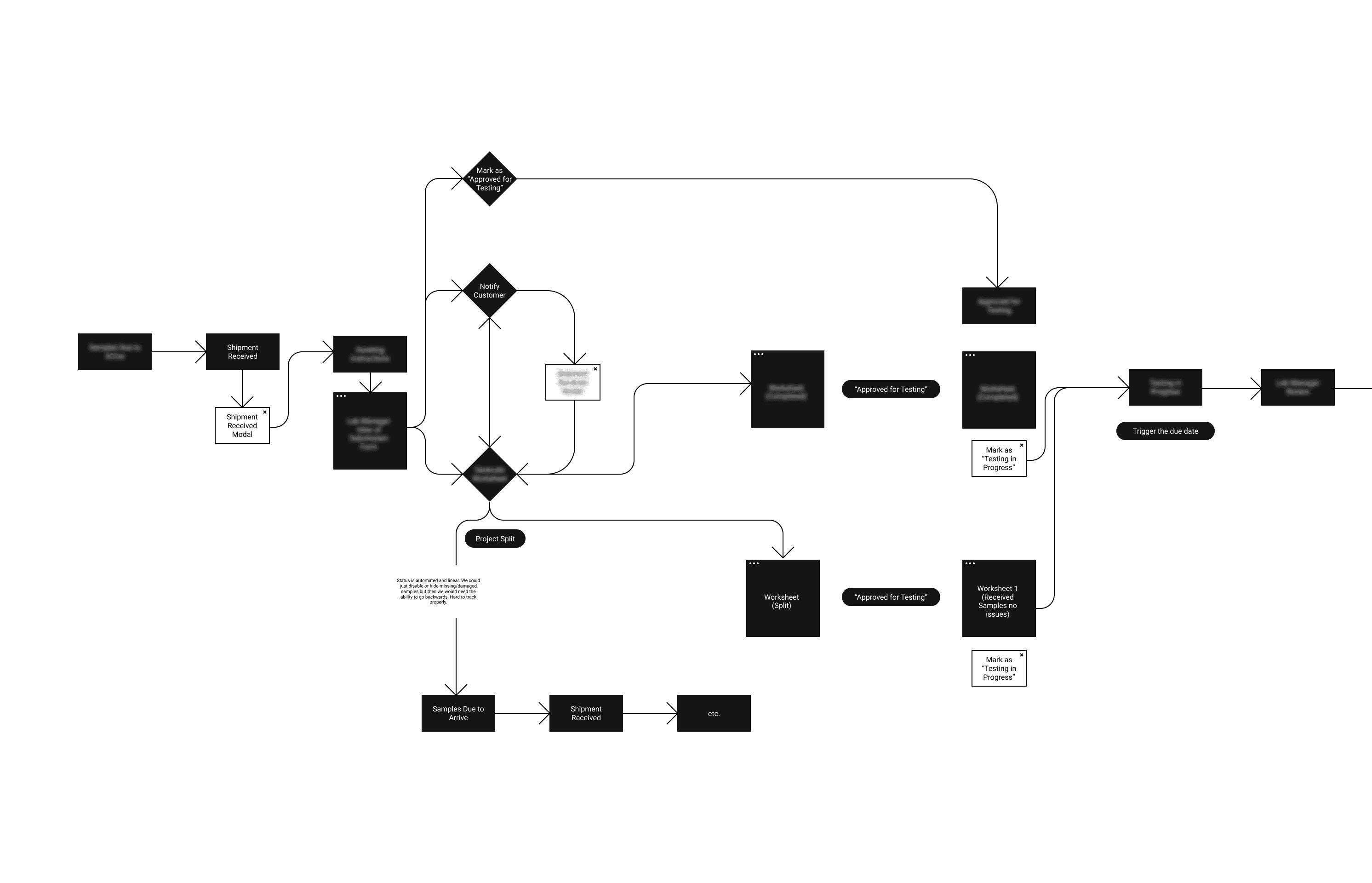
With the design for the graph screens approved, we were free to integrate them into the overall application. The report page pulls data from the backend, including information from the testing stage and customer submission forms. Any gaps in the logic of these initial stages would affect the final result.
I faced a challenge with a short onboarding period and a tight project timeline. However, a fresh perspective can be beneficial. By mapping out each status change—customer submission, confirmation, testing, etc.—I identified the gaps and determined the necessary screens to build.
Knowing when to keep something and when to tear it down
I faced the challenge of deciding which elements to retain from the original design by the senior UX designer and which ones to completely rework. This process was critical to ensure that the application met user needs while maintaining a cohesive and intuitive experience.
One significant decision involved the customer shipping instructions during the submission phase. It was crucial for these instructions to be clearly visible without disrupting the user flow. After analyzing user feedback and testing various iterations, I decided to integrate the shipping instructions into a sidebar that remained accessible throughout the submission process. This approach preserved the visibility of essential information while allowing users to complete their submissions smoothly. Balancing these design elements required careful consideration and user-centered thinking, ultimately leading to a more efficient and user-friendly application.
UI Elements
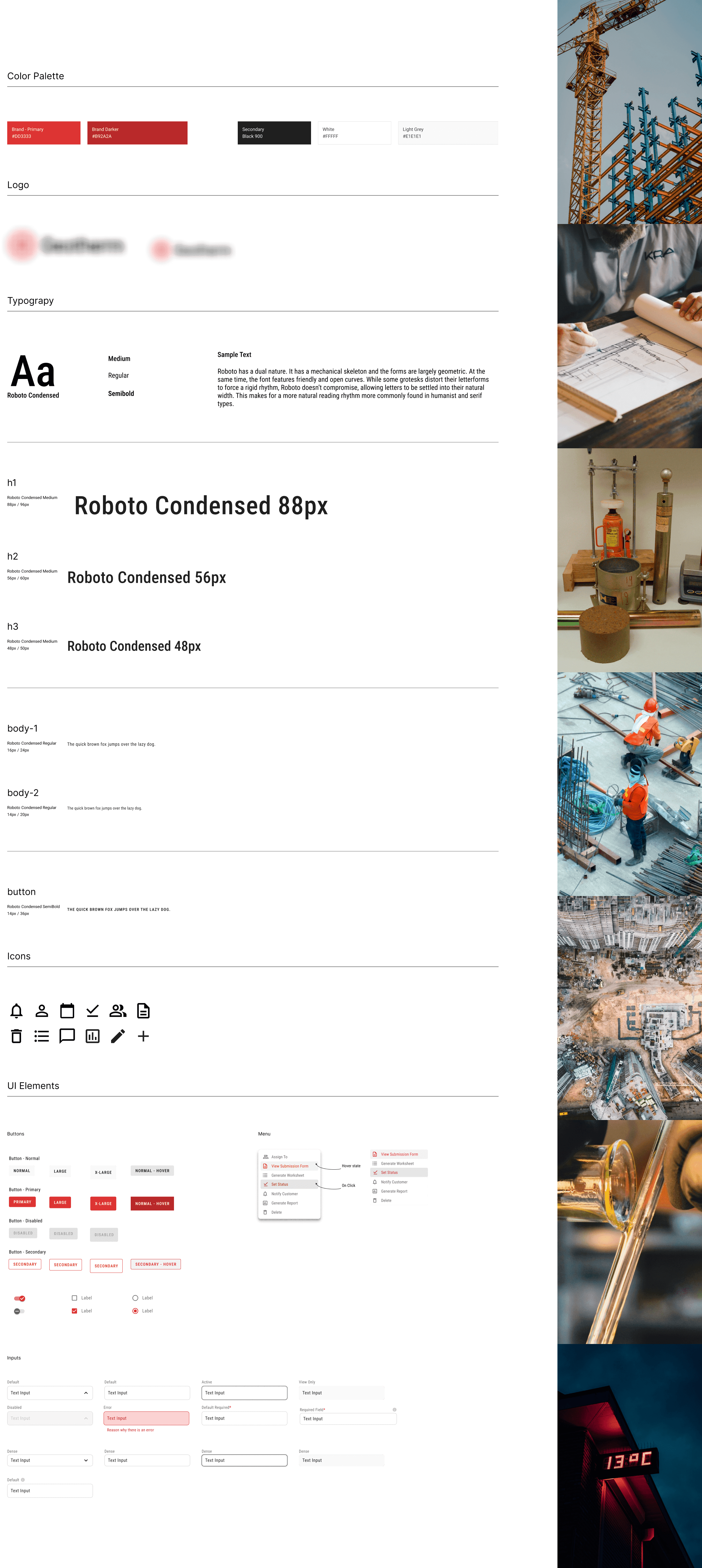
Design Library Decisions
In enhancing the existing design library, I focused on borrowing and adapting elements that were already in place. This approach ensured consistency while introducing improvements. One key enhancement was the addition of iconography that more accurately reflected user actions. By carefully selecting and designing icons that were intuitive and aligned with user expectations, I was able to create a more seamless and engaging user experience.
I also paid close attention to the aesthetic elements, such as the font, buttons, and color scheme. The use of Roboto Sans and the bold red color palette were particularly fitting for the scientific nature of the client’s business. The sleek, modern typography of Roboto Sans conveyed a sense of precision and clarity, while the red accents added a touch of vibrancy and urgency, underscoring the importance of the data being presented. By harmonizing these design elements, I was able to create an interface that was not only functional but also visually aligned with the client’s branding and industry.
Learnings
This project is still ongoing, and I'm pleased to share that the clients have decided to bring me on for the next phase due to the impact of my work so far. This extension is a testament to the successful integration of design enhancements and the value they bring to the user experience.
Throughout this project, I learned the importance of quickly onboarding and absorbing information. Understanding the existing framework and respecting the original roadmap were crucial. I realized that not every element needed reworking—sometimes, maintaining what works well is just as important as implementing new ideas. This balance allowed me to make informed decisions that improved the application while preserving its core functionality and design integrity.